The Java code to calculate the basic Discrete Fourier Transform can be found here in tar format. See the main Fourier transform page for a link to the tar program.
When I read that a DFT is calculated over a set of points, I expected that this referred to a sliding window over a larger data set. This incorrect assumption resulted from the fact that I came to Fourier analysis via wavelets, where a sliding window is used. In fact, the number of points refers to the data set over which the DFT is calculated. So if there are 64-points in the data, a 64-point DFT is calculated. The DFT algorithm is an N2 algorithm, so computation time goes up rapidly with the number of points.
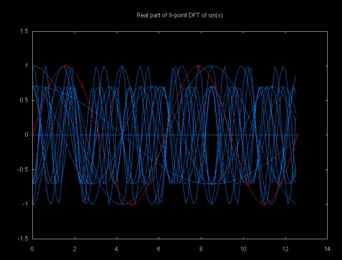
The DFT sums a set of cosine and sine functions scaled by the points in the data sample. I've tried to show this in the graphs below. These graphs have 17 data points (e.g., a 17-point DFT). The points are generated from the function sin(x). The sin(x) function and the data points are shown in red.
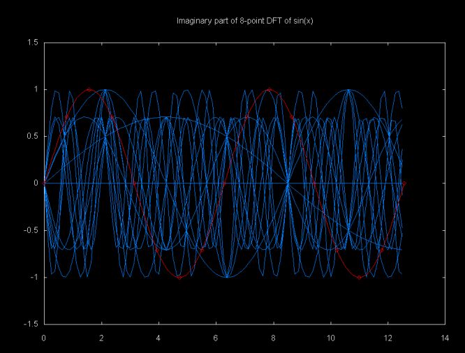
These graphs are displayed using gnuplot from data generated by the Java class dft_graph which can be down loaded here
The result of the DFT function, calculated over a range from 0..i is a set of complex objects. The mag() method will return the magnitude of the complex value. The magnitude graph for sin(x) is shown below. Only N/2 points are shown (in this case N is 17, so N/2 is 8). Only half of the points are graphed since the graph is symmetric and the next 8 points would mirror the first 8 points. The magnitude is adjusted to the same scale as the input signal, using the equation
adjMag = (2 * mag)/N
Where N is the number of points in the DFT. Note that the magnitude of the sin(x) is 1.0. Since there is only one wave form, there should be only one magnitude. However, the peak magnitude shown in this graph is slightly less than 1.0 and there are smaller sub-magnitudes. This is an example of what Lyons calls "DFT leakage".
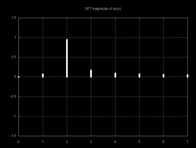
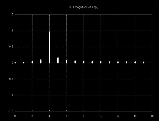
Note that the largest magnitude line is at 2. The sample over which the DFT was calculated has two sine periods. If this were a sampled signal we could relate this to frequency. The magnitude graph below is from a sample with four sine periods. As with the magnitude plot above, only N/2 magnitudes are displayed, since the other half of the magnitude plot is symmetric.
The interpretation of magnitude plots gets more obscure as the signal gets more complex. The function
f(x) = sin(2x) + sin(x) + sin(x/2)
is shown below.
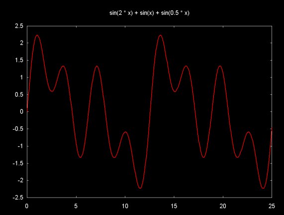
The signal in this graph is made up of the sum of 8-periods from sin(2x), 4-periods from sin(x) and 2-periods from sin(x/2). The graph below shows magnitudes that result from the DFT of this signal (sorry, this version of the DFT graph is mislabeled).
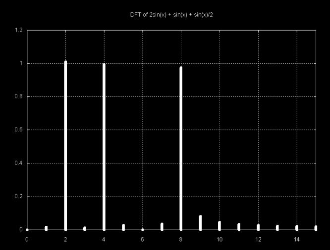
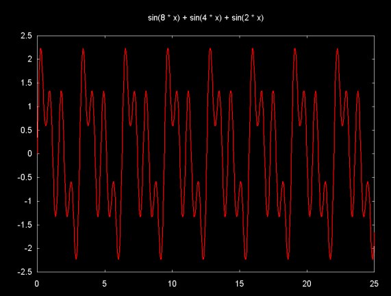
Each of the large magnitude points above represents one of the frequency components of the signal. In absolute terms this frequency relates to the sample. The sample contains the sum of a two period sine wave, a four period sine wave and an eight period sine wave. The relationship between the sample frequency and the sampled signal depends on the sampling frequency. By including more signal periods in the sample, the DFT frequency goes up. For example, if the signal above is multiplied by four, we get the equation:
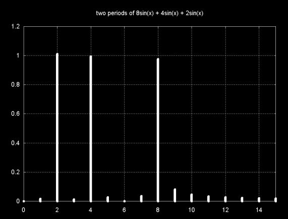
f(x) = sin(8x) + sin(4x) + sin(2x)
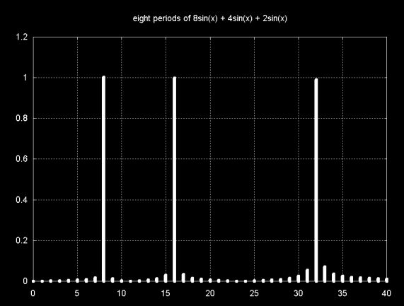
Keeping the sampling region constant (0..25) on the x-axis yields a sample with four times as many periods. The graph is shown below (this version of the DFT graph is mislabeled).
Graphing the magnitudes that result from the DFT of this sample also shows the mangnitude frequencies increased by a factor of four as well.
Since the frequency of the DFT result is related to the sample, if the sample is reduced, so that there are only have two periods in the sample, the DFT result will show a lower frequency. The graph below shows f(x) = sin(8x) + sin(4x) + sin(2x), however the sample region is 0 ... ~6.25 (e.g., 2Pi)
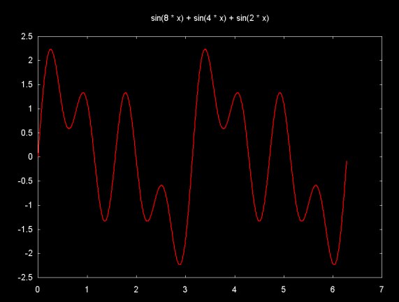
The DFT magnitude result is plotted below. Note that this result is the same as
f(x) = sin(2x) + sin(x) + sin(x/2).
I attempted to regenerate some of the graphs that I've displayed here in my web pages that discuss time/frequency analysis using wavelets. I noticed that the equations that I used to label the plots were incorrect. In particular where I should have written sin(8x) I wrote 8*sin(x). The discussion and the the plots of the sine functions are labeled correctly now, but the DFT plots are still incorrect. I hope that the reader will forgive this error.
Ian Kaplan, September 2001
Revised: April 2002
Back to A Notebook Compiled While Reading Understanding Digital Signal Processing by Lyons
